Get a free digital strategy tip of the week:
Unsubscribe any time. We respect your data. View the privacy policy.

Imagine you’ve been asked to have an important conversation with ... ‘someone’. Chances are, you’ll be much happier to have that conversation if

Preview text appears in most email clients in the form of a few words after or below a subject line. While it doesn’t

A well-placed stat will add weight to your writing—particularly when it’s referenced with a credible source. When working with numbers, all care must

I know what you’re thinking. “Subject lines”. And you’d be right. Subject lines are hailed as the ‘be all and

Take your time. In the pursuit of saying more with less, I’ll admit—not every big idea can be reduced to a snappy soundbite.

Think of digital pipelines as pathways that lead your supporters down progressively deeper levels of engagement. Without designing your pipelines intentionally, your supporters

The education system taught many of us that long words and complex sentence structures are signs of sophistication. Un-learn this as fast

Technology moves at light-speed. Every day, smart people are pushing the boundaries of digital design, user experience, and communication. If we hope

You might know definitively that your call-to-action (CTA) is the single-most strategic thing your supporters can do today to help your cause.

How does the past experience of people on your list influence their interest in receiving ongoing email from you? It turns out

Bolding the odd word or phrase can help skim readers catch key ideas you don’t want them to miss. It’s also great for

I’m not saying don’t do heroic things. Keep that up! But when you’re telling your supporters a story of injustice, there’s only

If we want to get the most out of email, we need to make it personal. If every message we send sounds

On-page videos can be your best friend and your worst enemy. At the same time. Know the pros and cons so you

For several years, I drove a strategy at Animals Australia to send ‘thank-you’ emails to action takers that were jam-packed with followup


Here’s an important piece of digital communication that you’ve probably never read:
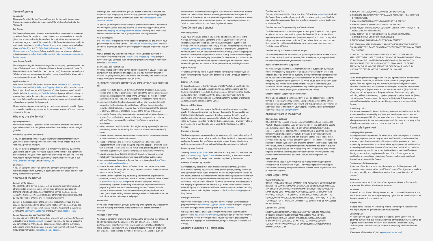
Few of us pay attention to stuff like this. And not because it doesn’t contain important information. It does. You’ve probably never read it because it was designed not to be read. This masterpiece is the Youtube Terms of Service. Points if you thought it was the Facebook privacy policy. Or the IOS user agreement.
Readers have a sixth sense for knowing when something is likely to be an unenjoyable read. A ‘wall of text’ is the first sign. It’s easy to forget this when we’re the ones writing the content.
How people really consume online content
Eye-tracking studies reveal that very few people read emails or web pages from start to finish. More often, our reader’s attention darts all over the place in an effort to absorb information as quickly as possible. In a few short seconds, your reader will decide whether to invest time in your content or give up. The strength of your visual cues will determine how often that decision falls in your favor.
It won’t matter how amazing your content is if your formatting doesn’t convince people to read it
Still reading? Pat yourself on the back—you’re one of the few! The hard truth is that a big chunk of your audience won’t read your beautifully-written content. At best they’ll skim it. Don’t give up on these readers just yet! With strategic formatting you can still reach them and convert them.
Lead with a strong headline
This is the one thing that everyone will read. Put time into it. Learn to write page headlines that work. Here’s where to start:
- Make your headline click-worthy (not click-baity)
- Give your headline ‘consequence’
- Identify your headline’s ‘value proposition’
- Why picturing your headline ‘off page’ is key to its success
Use a powerful hero image
A single compelling visual will reinforce your headline and make your subject matter feel concrete—both on your page and as a link preview on social media. Quality and composition matters. Follow these tips to choose an effective hero image.
Subheadings should hold their own
Subheadings are great at breaking up walls of text. But they can achieve so much more. Anything that visually leaps off your page should build meaning. What message are you sending skim readers who might only read your heading elements? Do you see impact, intrigue, or a compelling message?
Just like a headline, if a subheading is vague or lacks meaning without context, it’s not pulling its weight. If it merely rephrases another headline element, it’s redundant. Strengthen subheadings by turning them into concise, active statements that each bring something new to your page.
Strengthen subheadings by turning them into concise, active statements that each bring something new to your page
Be bold
Help your skim reader pick up on key information within paragraph text by bolding keywords selectively. But beware that’s it’s easy to go too far. Learn how to strike the right balance.
Unlock more digital strategy secrets.
Free eBookOther visual cues
The cliché is true: a picture is worth a thousand words. If you can save words by saying something visually, do. Photos communicate information fast which makes them valuable to skim readers. They also give text ‘breathing space’ which is vital for carrying readers through long-form content. Size and quality matters, so invest in decent images or stock photography. Just remember to add captions and alt text for SEO and accessibility.
If you want to include a confronting or graphic image on your page, consider using ‘click to reveal’ treatment. Your visitors will appreciate being given the ability to control their exposure to upsetting content.
Well-placed videos can enrich your reader’s experience. But they won’t play directly through emails. And even on web pages, there are some traps you’ll want to avoid.
Most things that aren’t paragraph text will draw the eye of skim readers. Bulleted lists, pull quotes, diagrams, infographics, action buttons, and other custom-designed elements (such as image galleries, sliders, form elements, etc.) can all break up content, build meaning, retain interest, and supplement any missing parts of your visual narrative.
Find balance
For the same reasons you should resist throwing every argument at your reader, you’ll want to use attention-seeking visuals sparingly, too. Too many will start to ‘fight’ each other. Aim for clarity. Short content might need very few formatting elements to perform well. Longer content will need more.
Make it look good on mobile
Whether it’s an email or a web page, chances are more people are looking at it on a phone. Make sure it’s responsive. And if you’re creating an email layout, consider how it will appear in the increasingly popular dark mode.
Put your formatting to the test
How our readers consume digital content is very different to how most of us write it. That’s fine. If you don’t intuitively ‘think visually’, just remember to go back and add subheadings and other visual cues to break up your text and guide skim readers.
Then consider this simple scanability test: do your headlines, first lines, subheadings, bold keywords, visual cues, and CTA buttons alone convey purpose, uniqueness, and urgency?
We can’t control whether a reader stays for 10 seconds or 10 minutes. But the neat thing about strategic formatting is that it doesn’t matter—you have full control over which parts of your message readers will pay attention to.
Was this tip useful?


 Don’t let these ‘cognitive biases’ hurt your conversion rates
  Email tokenization: what is it?
  Why people don’t complete online actions (and what to do about it)
Hi there! I’m Karen. I’m on a mission to reach my former self. Had I known 10 years ago what I know today, I could have achieved more good, made fewer mistakes, and had more weekends. Every time we share what works, we win faster. Let’s create digital experiences that move people — that grow our base and fuel our movements. Are you with me? Please share this with someone you know who wants to up their digital game!
Like this tip? Share it!